Posts

Good designs around the globe. Is your product on this list?

Image
This will a collection of good user experiences for products/applications around the globe. I plan to include anything and everything that contributes to delivering a good user experience, customer experience (CX) included.  This post will cover everything -  micro, macro, component-level and complete holistic experiences, that create a user-friendly experience, minimize pain points and are informed by data and research. Let's start, shall we? 1. Calendar experience - Express Script Job portal    Stumbled upon this while filling out a job application and this made my day. To understand a job applicant as a persona, they are candidates that might apply to multiple jobs on a daily basis. Candidates who are actively and aggressively looking for one, want to upload their details as quickly as possible so that they can focus on prepping for their interviews.  At this time, you want application portals to quick, simple and easy to use, accurately consuming your information and

Why The UX Industry Needs Junior Designers Now More Than Ever

I'm back! Stronger, wiser and sharper. Been away from blogging for 8 months, this is my first blog post ever since and I would love to share my thoughts on what's happening in the world of UX. Anyone who's been through the rigorous UX interview process as a junior / mid level would easily relate with this. It's something I like to call 'the experience gap', which results in the lack of UX design / research roles for junior designers and fresh graduates or lowers your chances of landing a generic UX designer role. Most jobs you see on job sites are targeted to senior / lead designers or expect you to have experience leading a team of designers or be the brainchild behind designing a successful product end-to-end, leaving entry-level designers high and dry of avenues to apply their skills in a professional environment.  Another instance of this problem is when you apply for a role that requires 3-5 years experience (mid-level), get interviewed but not selected

Story Map v/s Journey Map

Image
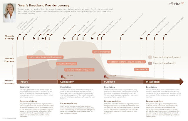
Most professional level projects incorporate one of these in their design process and designers use these terms interchangeably quite often. But well, they aren't the same. Both of these are solid design concepts that contribute hugely towards breaking down the complete design problem and making it more understandable for the designers/stakeholders. So here's what I personally believe is the difference between these: Journey Map The Journey map not only describes the journey of the user/product but also highlights user thoughts, experience, comments and goals. It incorporates the user's traits, pain points, possible actions and emotional/physical experience. The journey map could be of a user or a product - the former would primarily focus on the user's journey while using the product and the latter would highlight checkpoints in the product journey cycle like the design methods adopted, design reiterations / refinements, what worked, what didn't etc.  The j

How Spotify's desktop website UX has changed since 2006

Image
Here's how Spotify, a brand which now defines online music streaming, has gone through a number of serious changes (including a major design overhaul) in its desktop website UX. Here's what I think about the designs, 2006 2006 -  Notice how the UX of the website reflects a rudimentary idea. The elements are well-structured with the right amount of attention  given to every element (notice the large logo and the  mid-sized text that asks users to sign up). However, this doesn't tell users why they should be excited for the service. The idea still reflects simplistic yet minimalist design. 2007 2007 - Here they go a step further to explain what Spotify will be doing. Guess too many users asked them what the idea was! The elements are unstructured, with some (the sign up section) taking too much space. Notice how all the info-text has been boxed into the text-area in the middle. The text is verbose and extraneous, something not every user would

User Experience and Design

Image
Just came across this image on a social networking website. While most members of the group that shared this happened to blatantly accept this fact or just laugh it off saying the person who made this seemed to know very little about user experience, I personally think there's a lot more to this image. User experience (here, user adoption) and design may not always follow the same route when it comes to designing an intuitive and interactive user experience. Consider a use case of an travel website where the customer wishes to just checkout as soon as possible after booking, say, a flight. (The shortcut route). The website has a great design and many interactive components to explore. But, the design is such that, though simplistic, it takes the user through a number of steps like asking if he/she would like to select a hotel at that location, and then maybe a car rental and then maybe a adventure sports trip (The tiled route with great design). This just creates