How Spotify's desktop website UX has changed since 2006

Here's how Spotify, a brand which now defines online music streaming, has gone through a number of serious changes (including a major design overhaul) in its desktop website UX.
Here's what I think about the designs,
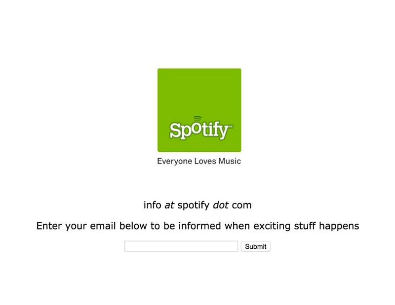 |
| 2006 |
2006 - Notice how the UX of the website reflects a rudimentary idea. The elements are well-structured with the right amount of attention given to every element (notice the large logo and the mid-sized text that asks users to sign up). However, this doesn't tell users why they should be excited for the service. The idea still reflects simplistic yet minimalist design.
 |
| 2007 |
2007 - Here they go a step further to explain what Spotify will be doing. Guess too many users asked them what the idea was! The elements are unstructured, with some (the sign up section) taking too much space. Notice how all the info-text has been boxed into the text-area in the middle. The text is verbose and extraneous, something not every user would be interested in.
 |
| 2008 & 2009 |
2008 & 2009 - This is much better. The UX of the website reflects the product of a brand that is both confident and clear of its idea, motive, goals and target audience. The elements of the screen are now well-structured, the info-text is short and simple and all other information has been perfectly categorized with the help of a navigation menu, Notice how icons have been leveraged to succinctly convey the idea. This makes the page less clutter-y and aesthetically pleasing.
 |
| 2010 |
2010 - Clearly reflects a brand that is growing and adding many more products/features to its service. Something that the previous designs lacked was the judicious use of white space. This design makes the best use of the space available to get the message to the masses. Notice how text and visuals complement each other while conveying an idea which ultimately contributes towards clean and consistent design.


 |
| 2011 |
2011 - Similar to the 2010 design, but now has many more options and visual components. The entire website has a cartoon-y feel thanks to the visual components it uses. Information like product info and subscription is taking up a lot of space. The same information can be compressed and boxed into a smaller space. Also, sections like 'Jobs' which aren't holistically a part of the product can be incorporated in the site map in the footer.
 |
| 2012 |
2012 - The site has switched to minimalist design by having a landing page with no other option but downloading the app. Minimalist design has its upside and downside. Upside being that now, the website much cleaner, clutter-free and uniform. However, it assumes the user knows pretty much everything about the service and limits the user's actions (here, downloading is the only option available).
 |
| 2014 |
2014 - Great stuff! Parallax scrolling and great imagery, keeps the user glued to the site. The design also sports a trendy, vibrant look, typical of a music website. Also, notice how the features of the free and premium version have been succinctly boxed in a package. This takes up less space and also tells the user the advantages/disadvantages of using any. However, the huge imagery and limited text force the user to scroll a lot to access even little information.
 |
| 2015 |
2015 - Much better! The extraneous imagery has been removed and the website now strikes a the balance between text and visuals while maintaining the context, The premium and free package section now uses a compare-and-contrast info-structure to distinguish between the features provided by each which helps the user easily recognize the product and what it offers. The website design has come a long way from what it was in 2011.
 |
| 2016 |
2016 - Has the same visual attributes as the previous design. The switch to a more vibrant theme definitely seems to work. Good work in using a scrolling banner. Fits in more information and also, blends well with the design

Comments
Post a Comment